Nine formats · Six screen-first skills
Marketing art lives on a six-inch screen. Most of it was designed on a 27-inch one.
A phone gives your creative a second and a half, half of it muted, most of it in dark mode, all of it under a thumb. The gap between “nice campaign” and “work that performs” is knowing which craft each placement actually rewards.
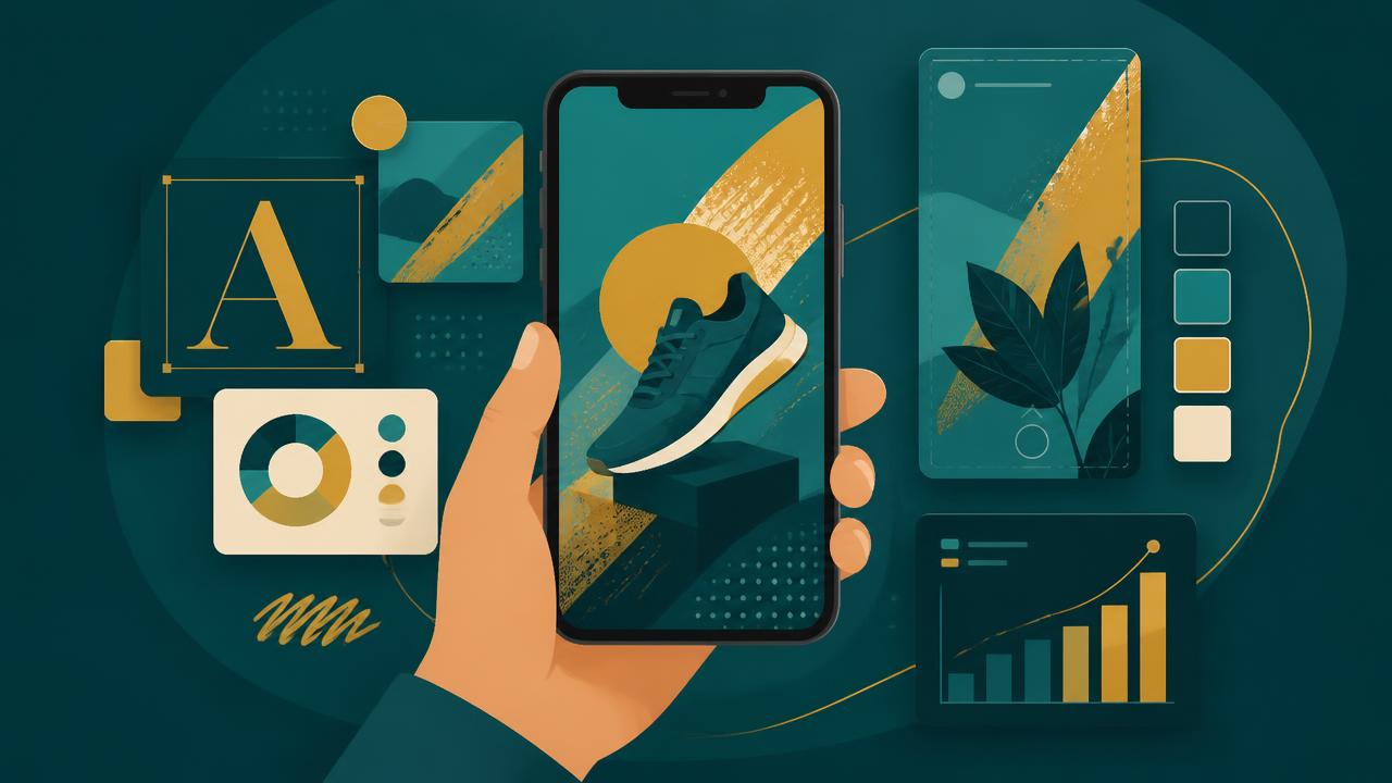
A phone is not a small billboard. It's a different medium.
Vertical frames, muted autoplay, OLED saturation, dark backgrounds, cropped safe zones and a hand covering the bottom corner — none of these exist on the canvas where most marketing art gets made.
Each format below is written the same way: what it actually is, what to get right first, when to make it, and how long it should honestly take.
The formats
Social · In-app · App store
9:16 · Instagram & TikTok Stories
Vertical Story Art
A story frame is a poster you hold in your hand. Anything smaller than a thumbnail is decoration nobody will ever see.
- Get right first
- One subject, one promise, safe zones clear of the UI chrome
- Make it when
- Design at 1080x1920, review at 30% zoom
- Give it
- 45 min per concept
1:1 & 4:5 · Feed placements
Thumb-Stop Static
The feed gives you 1.7 seconds. Contrast and a single focal point beat a beautiful composition every time.
- Get right first
- High-contrast subject, cropped tight, negative space for the hook
- Make it when
- Test three crops of the same frame before new art
- Give it
- 30 min per variant
Typography · All placements
Mobile Type Systems
Desktop type scales collapse on a 375px screen. Mobile headlines need weight, not size.
- Get right first
- 24px minimum body, 1.1 line-height display, two weights max
- Make it when
- Proof on a real device in sunlight, never on a monitor
- Give it
- 1 hour to set the scale
6s loops · Reels, Shorts, in-app
Motion & Loop Ads
Most mobile video is watched muted. If the first frame and the captions don't tell the story, the sound design can't save it.
- Get right first
- Hook in frame one, burned-in captions, seamless loop point
- Make it when
- Cut to 6s, then 15s — never the reverse
- Give it
- 2-3 hours per cut
Screenshots & icons
App Store Creative
The first two screenshots carry the install. The rest are read by roughly nobody.
- Get right first
- Benefit captions above device frames, icon legible at 40px
- Make it when
- Refresh with each seasonal campaign
- Give it
- Half a day per set
Playables · HTML5 units
Playable & Interactive
A playable earns attention by giving something back. One mechanic, learnable without instructions.
- Get right first
- 3-second tutorial, single tap mechanic, end card with clear CTA
- Make it when
- Prototype before art direction is locked
- Give it
- 1-2 days
Adaptive assets
Dark-Mode Ready Art
Over half of mobile users browse in dark mode. White-background creative arrives as a glowing rectangle.
- Get right first
- Transparent PNG logos, two background variants, tested contrast
- Make it when
- Build both variants in the same file
- Give it
- 20 min extra per asset
Palette craft
Color for Small Screens
OLED screens push saturation. Palettes that sing on a calibrated display can turn acidic in a pocket.
- Get right first
- 4.5:1 text contrast, one accent, muted supporting tones
- Make it when
- Check on an OLED phone at 40% brightness
- Give it
- 1 hour
Native-feel video & static
UGC-Style Creative
Polish reads as an ad. Handheld framing, real rooms and imperfect light read as a recommendation.
- Get right first
- Front-camera framing, spoken hook, on-screen text like a caption
- Make it when
- Shoot in batches, one hook per take
- Give it
- Half a day per batch
Six skills behind creative that performs on mobile
- 01
Design for the thumb, not the mouse
Tap targets at 44px minimum, primary actions in the lower third, nothing important behind a hover state that mobile will never trigger.
- 02
Lead with the hook frame
Whatever appears in the first 1.5 seconds decides the campaign. Write the hook first, then build art that earns it.
- 03
Build in modular layers
Keep background, subject, headline and CTA on separate layers so one creative becomes twenty resized, relocalised variants in an afternoon.
- 04
Respect safe zones
Every platform crops. Keep type and logos inside the middle 80% so nothing lands under a profile bubble or a progress bar.
- 05
Test in threes
Ship a hook variant, a visual variant and a CTA variant against the same audience. One change per test or the result teaches nothing.
- 06
Export like an engineer
WebP for static, H.264 for video, under 4MB, sRGB, correct aspect per placement. Compression artefacts cost more reach than a weak idea.
The production loop
- 01
Brief
One audience, one promise, one placement written down before any art starts.
- 02
Hook
Draft five hooks as plain text. Only then design the frame that delivers the best one.
- 03
Build
Master file at 1080x1920 in modular layers, exported to every placement ratio.
- 04
Read
Watch hook-rate and hold-rate, not likes. Kill, keep or iterate within a week.